Words for the Murray Morgan Bridge?
As work continues on the Murray Morgan Bridge, bringing the day we’ll be able to use the bridge ever closer, we noticed an interesting proposal for the bridge in the Tacoma Daily Index.
Tacoma’s Landmarks Preservation Commission will consider a proposal to install letter signage on the Murray Morgan Bridge.
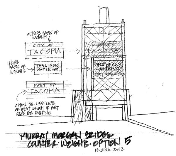
The plan calls for the words “City of Tacoma,” “Port of Tacoma,” and “Thea Foss Waterway” to be spelled out in 48-foot-tall letters on the bridge’s two east and west counterweights, according to Tacoma public works engineer Tom Rutherford. Commissioners will also consider which counterweights will receive the signage and the font. If the plan is approved, it would be a return to form of sorts for the old bridge. A historic photograph circa 1915 shows similar historic lettering on the counterweights.
Yeah, we thought 48-foot letters on the bridge sounded pretty huge too. City documents actually list the signage as 48”, so it appears that the proposed signage would be written in 4-foot tall letters, rather than nearly 50-foot letters, although that would have been exciting too. Tacoma’s Landmarks PreservationCommission is scheduled to discuss the proposal today at 5:00 p.m.
Hmm. Interesting… Do you like the idea of restoring the words to the bridge? Any font preferences?
This historical photo shows the bridge circa 1915.

Read the story from the Tacoma Daily Index.
Filed under: murray-morgan-bridge, tacoma-landmarks
25 comments
C Chris August 8, 2012
Replicate the font from the old lettering.
Great photo. Look at those Municipal Belt Line streetcar tracks in 1915! Tacoma Rail exists because of those tracks.
S Sarah August 8, 2012
Noticed this in the Landmarks packet last week and was intrigued.
I think its an awesome idea and the fact that they are even considering it is a big step. It seems like they are truly trying to bring it back to its historical self.
Many people think the bridge is an eyesore, but I think this will help make it more endearing and bring a little historic pride.
Chris – the proposal is to replicate the font as close as possible to the original.
A Alexsander Mausheim August 8, 2012
My question is, how is the 11th Street bridge an eyesore? Tacoma’s heritage is her future.
Regarding the signage- let’s do it and replicate the style of the original lettering as closely as possible- but change it to the phrase from the 1909 Alaska-Yukon-Pacific exposition- “YOU’LL LIKE TACOMA”.
A artifacts August 8, 2012
Credit to the project manager for attention to detail and the rediscovery of a fine idea. Chris is right about paying close attention to replicating the font and type size for the lettering. Against the black fierce form of the bridge, the signature will look great. Great bridges have names, define places and tell stories. The signage will help ours do all of these things better.
H honeydew slausen August 8, 2012
Given that the Port of Tacoma actively opposed the City’s efforts to restore the Murray Morgan Bridge, I wouldn’t put their name on any part of the bridge. I like the idea of including signage similar to what used to be there.
J jamie August 8, 2012
Along with our 50 foot tall letters, hopefully we can also get an 18 inch Stonehenge.
(This is cool.)
T Thorax O'Tool August 9, 2012
If these letters are made of LEDs, you have my enthusiastic, FULL support.
J Jesse August 9, 2012
If they choose to use paint, it will chip off if they don’t block-seal the whole piece of concrete first.
I’d suggest using an chemical bond epoxy (not the fake stuff sold practically everywhere) “paint” so the mural stays a while.
But ya, totally awesome idea.
G Gerry August 9, 2012
Forget the oversize signage. Thats like labeling the Batcave “The Batcave”, there’s no need, it’s expensive and redundant. Instead, how about some artful lighting of the structure so it can be seen from I-5?
J Jake August 9, 2012
How about a metal mesh material for the sign and have the lettering shadowed so you can see the words when looking straight at it but not when at an angle?
J Jenny August 9, 2012
I like anything that gives a nod to the past while also looking forward to our future. The idea of replicating the exact signage while incorporating LED lighting is interesting…enhancing lighting is as well. I’d suggest bringing in a great environmental designer who can take bring the past together with the future, that way we begin to think about the bigger picture (tourism, PR, etc).
J jsisbest August 9, 2012
If I understand the sketch, they’re proposing putting lettering on the back side of the counterweights as well… I think that may be too much and difficult to see. I’d stick to letters on just the outside faces of the counterweights. Not everyone knows the bridge as the Murray Morgan, but we all know we’re in Tacoma. So why not just put “Murray Morgan” on both counterweights. I agree with previous posts, the typography/font is critical. The old letters appeared to stand off the counterweights as objects, rather than just painted on.
S Spencer August 9, 2012
Maybe it’s forty 8 foot letters?
C Chalky White August 10, 2012
Great idea to paint some letters on the bridge. It needs something because the new coat of black paint makes it invisible at night. I hope there is a way to enjoy this landmark when it’s dark. It would be a shame to watch this disappear from our night skyline.
S Sarah August 10, 2012
Sad to see the keepers house on top is no longer there!
D David Boe August 10, 2012
Sarah, the operator house is still there. The machinery house on top of the lift span has been removed to allow installation of new mech/elect machinery. A new machinery house will be constructed that matches previous one per historical standards.
N Nick K. August 11, 2012
NEON! Red letters.
R RR Anderson August 14, 2012
late to the party… Love this idea
R RR Anderson August 14, 2012
“You’ll Like Tacoma” on the front,
“Smell Ya Later” on the back.
also we should paint the blocks in chalkboard paint… and or install digital billboards on them that you could watch movies on during hot summer nights. Bring a lawn chair!
F Flannimal August 14, 2012
you are seriously asking about font? I thought Tahoma font would have been painfully obvious!
A Angela Jossy August 14, 2012
It would be neat if the letters looked exactly the same as the historical ones but were actually some sort of backlit screen so the words could change occasionally.
I’d like people to see messages like:
“You’ll Like Tacoma”
“Shop Tacoma”
“Dinners ready!”
“Aroma? Wha? We don’t smell anything.”P Peter Peter August 14, 2012
So this appears to be a David Boe drawing of “Option 5” for the bridge. What happened to options 1 through 4. Is that where the treasure is hidden?
E Exit133 staff August 14, 2012
For those of you with questions about the font, here’s what the proposed font would look like:
E Exit133 staff August 14, 2012
Here’s the images that goes with comment #24 from D.G. Burns:
And here’s another image he shared of the old neon signage from the Puyallup Bridge once upon a time:
These are pretty cool.
R Richard Sims August 15, 2012
I would prefer to see the original font and phrases that were on the bridge when it was built. However the idea of some lighting to enhance the visibility from I-5 appeals to me as well.